From Elon Journal of Undergraduate Research in Communications VOL. 6 NO. 2Color Theory and Social Structure in the Films of Wes Anderson
By
Elon Journal of Undergraduate Research in Communications 2015, Vol. 6 No. 2 | pg. 1/1
IN THIS ARTICLE
KEYWORDS
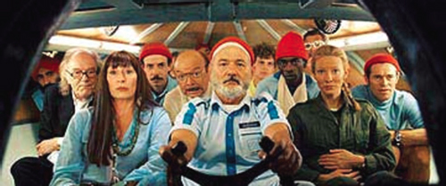
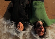
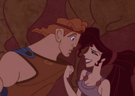
AbstractFilmmaker Wes Anderson has developed a distinct aesthetic style that is easily recognizable through his use of striking color palettes. The purpose of this research was to draw conclusions about social stratification, social construction and the role of family as they relate to color palettes in Anderson's films. Relying on the auteur theory, the research related Anderson's personal experiences with those of his characters and aimed at discerning the importance of color as it connects to social structure. I. IntroductionSince the turn of the 20th century, cinema has been embedded cross-culturally as a social lens through which societal norms and values are portrayed. Cinema's effectiveness hinges on many factors that can make a particular story powerful. Unique screenplays, popular actors, state-of-the-art cameras, lighting and sound design all play large roles in the value of a production. Blockbuster films do well at the box office for their promotional appeal, yet le septième art, the seventh art as cinema is commonly known, is deeply rooted in artistic interpretation. Aesthetic input is arguably the most powerful tool a director has in establishing a specific tone and connecting it to the hearts of his or her audience. Directorial style transcends the art of moviemaking in itself. Often times, it becomes a defining generational trait or a way of life. Such is the case with American filmmaker Wes Anderson and his whimsical color palettes. Cinema as a microcosm of contemporary societal structure has an innate power to shape the perception of those who are exposed to it. Of all the elements of visual design, color may be the most difficult to understand in how it psychologically affects humans. According to Yumibe (2012), "Through its sensual appeal, color can move the mind and emotions of a spectator. This understanding of the interconnection of the senses, intellect, and emotions is also, broadly construed, synesthetic in nature" (p. 32). This synesthesia, or response involving more than one sense, is common among viewers of Anderson's films. What an audience experiences through diegetic space on screen is a sensory combination of actions and sound set in color to mimic real life. The implementation of color in an image creates certain psychological responses in the brain, causing viewers to relate colors to specific objects and emotions (Gegenfurtner & Sharpe, 2000, p. 317). Colors carry significant meaning in society, whether consciously acknowledged or not. Anderson follows a common aesthetic "guideline" in portraying themes that are intrinsically similar in value. "[His] films are cinematic dollhouses: their wonder is in the perfection of their recreation of the larger world outside their frames" (Austerlitz, 2010, p. 382). Anderson meticulously crafts his visual imagery for the screen so that an audience recognizes the intent of his work as a director, a distinct directorial style that has garnered him fame and notoriety in recent years. II. BackgroundThe use of color over the course of film's history is both controversial and misconstrued. Dyes and other methods of manual color correction have been used since the advent of the medium itself in the late 1800s (Yumibe, 2012, p. 2). Applied coloring in the silent film era as it relates to the correction and control of "natural" color in contemporary cinema is imperative in discerning the high aesthetic value of color in movies. Both applied coloring on acetate film in the early 20th century and the grading enhancements of digital video are rooted in one common goal: the manipulation of a perceived reality. The advent of digitalization is both lauded and scrutinized by many critics and historians. Specifically, the astronomical differences of post-production processes in celluloid film versus modern digital cinema are taken into consideration. In his book Digital Visual Effects in Cinema: The Seduction of Reality, Prince (2012) relates digital cinema as having enhanced effects on psychological comprehension among film viewers (p. 4). The process has become streamlined. In moments, a modern film editor can alter the reality of what a camera captured in live-action filming. "Visual effects are coextensive with narrative film, and digital tools have made them more expressive, persuasive, and immersive" (Prince, 2012, p.4). This "seduction of reality" is more easily achieved in digital cinema, relying strongly on color correction and lighting enhancements to create ultra-reality. In the framing and composition of an image, the balance of visual weight is imperative to an environment's sense of stability or instability (Hurbis-Cherrier, 2012, p. 50). Production designers have much to consider in the creation of an environment. They must establish tone, evoke a certain style, consider their temporal and spatial settings, and discern how actors will work in conjunction with their surroundings. Production design is a delicate piece of the puzzle, for visual aspects are the most significant in creating film perception and comprehension among audiences. Color, however, is the most psychologically misunderstood visual component in digital media (Block, 2008, p. 136). In the BBC film Do You See What I See? The Science of Color Perception, neuroscience and evolutionary biology point toward specific moods and reactions associated with colors (Robinson, 2011). These perceptions driving the responses are culturally constructed and engrained in a human's collective memory over time. Without knowing, one may sense a certain predisposition toward particular colors or have negative visceral responses to other colors. The film's narrator, Samantha Bond, relates that "perception is key" (Robinson, 2011) in considering sustained exposure to one color or group of colors. Anderson's routine production designer, Adam Stockhausen, says that he breaks down the nuances of his scripts into component pieces and studies imagery that will associate with particular aspects of the production in the context of Anderson's color palettes (Grobar, 2015). This meticulous attention to color and detail often comes across on screen as an overwhelming use of one or very few colors. His color palettes are moved to the "projective foreground" in the mind of a viewer, thus rendering it a dominant factor in his films (Yumibe, 2012, p. 116). Intense visual effects are common in cinema of the postmodern era, where films are widely considered social commentary. The advent of computer-generated imaging (CGI), along with the growing presence of three-dimensional screenings, has made it easier than ever before to generate perceived reality. This has, in turn, caused a variety of research to be done on visual strain among viewers. Pölönen, Salmimaa, Aaltonen, Häkkinen, and Takatalo (2009) conducted research on the discomfort of viewers in the presence of visual effects. Many viewers were affected by elements of visual strain. Some said these elements enhanced the experience of viewing a film while others found it detracting (p. 462). This evidentiary support contextualizes the psychological aspects of exposure to hyperbolic visual effects in cinema, something that characterizes the style of Anderson. In his book Sight, Sound, Motion; Applied Media Aesthetics, Zettl (2011) stresses the importance of stylized aesthetics in film. He presents research on how production design can influence aesthetic color perception and the ways in which color can create a desired psychological comprehension in an audience (p. 55). Humans adapt to various color signals in film, and these signals tend to cue us in to a certain focus or theme. Saturation and color mixing can be additive or subtractive in terms of content analysis. The relativity of color with objects in the diegetic space can influence the way viewers perceive an environment (p. 63). Lighting and color temperature also play a large role in establishing a mood or tone in film, and surrounding colors (contrasting or similar) can establish relationships between otherwise unlike objects. Zettl also relates color energy as it applies to the juxtaposition of light and color, thus rendering an aesthetic energy that elicits psychological responses based on color (p. 67). For example, Zettl states that the over-presence of red can create a sense of excitability among viewers or a feeling of desire. Green may soothe while yellow can allude to positivity or cheerfulness. The interplay of Anderson's light and color with his characters and other objects produces fascinating visual effects in the eye of an observer. Gegenfurtner and Sharpe (2000) claim that humans segment objects in our minds and perceive them to carry meaning based on their inherent color. The perceived magnitude or importance of a "visual modality" is influenced by its surroundings. Thus, viewers segregate objects from one another on screen and make assumptions as to their relation based on visual components alone (p. 337). Rhythm and pace of visual design create a pattern that emphasizes emotional response in the viewer that mimics that of contemporary society (Hurbis-Cherrier, 2012, p. 460). Such repetition of colors can establish mental biases toward colors in relation to certain nuances of society that a viewer might find displeasing, such as patriarchal power or laziness, two themes we find often in Anderson's films. The following case study attempts to examine the use of color palettes in the framework of the aforementioned affectations of color in the following Anderson works: Rushmore (1998), The Royal Tenenbaums (2001), The Life Aquatic with Steve Zissou (2004), The Darjeeling Limited (2007), and The Grand Budapest Hotel (2014). Through these films, the analysis attempts to discern how color production and design are used in character development and in the establishment of social structure in Anderson's movies. By viewing these films and studying their psychological connections to perceptions of color, these distinctions can be made. III. Theoretical FrameworkThe analysis of this paper is based on the auteur theory, otherwise known as auteurism. This type of post-modern cinema has an unwavering distinctive voice. Such films created by an auteur, or author, bear messages that act as social critique through the eyes of a director. Every aspect on screen is a direct representation of how a director perceives it in the context of his or her life. Through personal biases, le cinéma d'auteur underlines the point of view of a director as a means of expression. The director authors the film itself in manipulating the presentation of his or her content so that an audience may interpret it in a specific way. Alexandre Astruc, a French director from the 1950s, was one of the first to practice this directorial style. He coined it as le caméra-stylo, a French term alluding to the use of a camera as a pen. As an author would use a pen to write his or her emotions, a director cathartically use films as a means of self-reflection (Orgeron, 2007, p. 44). In turn this creates a style unique and recognizable of the director, just as is the case with Anderson and his films. Admittedly, Anderson is a fan of Jean-Luc Godard and François Truffaut (Seitz, 2013, p. 244), who are pioneers of this method in addition to Astruc. Citing this theory, the analysis reveals that Anderson writes and directs films that directly pertain to his experiences, thus utilizing color as an expression of society through his personal lens. IV. AnalysisColor Production and DesignUnquestionably the most laborious efforts in Anderson's films lie with the production and scenic designer. From the lavish hotel in The Grand Budapest Hotel (2014) to the unassumingly intricate submarine in The Life Aquatic with Steve Zissou (2004), his production design is unmitigated extravagance. Anderson, working closely with designer Adam Stockhausen, comes into a production with a specific color palette in mind and they work off of what colors work well in contrasting the presence of these colors. An interview with Stockhausen revealed the following about the process behind The Grand Budapest Hotel: The funny thing is, we started with all this pink, and I think this would be true of any color—if you use too much of it, you stop seeing it because it's everywhere and you start taking it for granted. So, we found that we had to add in yellows and different colors to kind of cut it back so you could see it more. (Grobar, 2015) Studies show that audiences have poor color memory (Block, 2008, p. 159) when reflecting on shortterm memory associated with digital media. By intensifying certain colors, Anderson creates an immediate association with his films. When hearing the title of a particular Anderson film, often times it evokes certain colors: Pink, purple and red associated with The Grand Budapest Hotel, for example. This play on contrast and affinity, or similarity of tone, makes his films easily recognizable. As aforementioned, visual cues such as brightness, shape, stereo-disparity and color facilitate the distinction of the observer (Gegenfurtner & Sharpe, 2000, p. 337). As we have seen, color plays into sensual appeals that affect emotional distance with the intrigue of a story. Yumibe (2012) characterizes this as an educational influence while citing Wallace Riminigton's ColourMusic: "Color, like music, is both precious for its own sake and as an educative influence. It can also stimulate the imagination and develop other mental faculties; can give pleasure and refreshment to the mind, and increase the responsiveness of the sense to which it appeals" (Yumibe, 2012, p. 34). Anderson plays with color in his set and production design in order to create a fantastical world unlike that known to the viewer. In an interview with BBC, Anderson says of his film The Royal Tenenbaums: "I am from Texas, but there were so many New York movies and novels which were among my favorites and I didn't have an accurate idea of what New York was like. I wanted to create an exaggerated version of that imaginary New York" (Mayshark, 2007, p. 126). This also appears in the pastel-hued sea creatures in The Life Aquatic with Steve Zissou (2004). Anderson gives audiences a glimpse of a seemingly perfect world of "dollhouse perfectionism" (Austerlitz, 2010, p.454) that juxtaposes the somber tone of his content. This brings about a certain perceived irony in his filmmaking when associating characters and the context in which they perpetuate their "type." Owen Wilson, a close friend and reoccurring player in the game of Wes Anderson cinema, said in a commentary, "It's a world that Wes Anderson creates . . . slightly artificial, but I think within that world the emotions and feelings are very real" (Mayshark, 2007, p. 117). Color as a Social CommentaryAnderson is a talented individual in that he can manipulate sound and image to transport an audience to other continuums. He is an "unrepentant hipster" who uses exuberant color tied to somber themes, creating "whiplash juxtaposition" for the audience (Austerlitz, 2010, p. 382). This visual modality is magnified by the contrast of what you see on screen with the action that is happening. Just as Truffaut does, Anderson tends to suffuse dark material with humoristic interactions. This is apparent especially in the childish bickering between Royal Tenenbaum (Gene Hackman) and his ex-wife's suitor (Danny Glover) Henry Sherman after Richie (Luke Wilson) tries to kill himself. The characters in Anderson's films often appear in multiple of his works. Bill Murray, Angelica Huston, Owen and Luke Wilson, Adrien Brody, Jason Schwartzman and Tilda Swinton all appear in at least 2 of his 10 films. Anderson grew up in Texas and went to high school with the Wilson brothers, calling upon them to act in and write numerous films and short films (Seitz, 2013, p. 31). His mother was an archaeologist, just like the character of Etheline Tenenbaum (Angelica Huston), and his father was not very present after divorcing his mother, just like the character Royal Tenenbaum (Gene Hackman) in The Royal Tenenbaums (2001). Much of Anderson's films, in keeping with the auteur theory, is a self-reflection of his childhood (Mayshark, 2007, p. 115). His stylistic choices and thematic elements of his original screenplays are portrayed through his lens as if he were a character. Mayshark (2007) states that the filmmaker has an avid fascination with recurring themes and interconnectivity in his films (p. 116). Social structure is one such large focus, as well as familial structures and intergenerational bonds and rivalries. Much of his work focuses on parents' relationships with their children. Mayshark (2007) also remarks that Anderson tends to portray a specifi c social niche of eccentric affl uence. These characters are precocious and immature, "but not, on the whole, badly intentioned" (p. 116). Problematic fathers also tend to be a central theme to Anderson's work as a whole, while mothers are less of a presence (in fact, many have died as a precursor to his fi lms). This is evident in the case of Steve Zissou (Bill Murray) in The Life Aquatic with Steve Zissou (2004), Royal Tenenbaum, and Herman Blume (Bill Murray) in Rushmore (1998). On the topic of fatherhood, Zissou says to his illegitimate son, Ned: "I hate fathers and I never wanted to be one." It is interesting that all of these male characters wear red, as if to evoke a certain boyish dominance. Zissou has his documentary crew wear red headwear as he does (refer to Figure 1), for in this case red represents the overcompensation of his insecurities about fi lmmaking. In The Darjeeling Limited, the three sons on the quest to fi nd their mother fi nd themselves at their father's funeral, with whom they were not close. His red vintage automobile is the only item that connected him and his sons. Chas Tenenbaum, Royal's son played by Ben Stiller, wears a red Adidas tracksuit from his adolescence until adulthood. As we come to know his two younger sons, Ari and Uzi, they wear the exact same suit. Max, Herman Blume's son in Rushmore, wears a red hat to his prestigious private school as he yearns for the affection of his father.
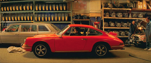
Figure 1. Steve Zissou with his film crew in red caps. Red seems to be a color of longing, having deep-rooted issues attached in the realm of fatherhood. In the case for these three fathers, they are a main source of confl ict in their families. "Even more than most directors, Anderson uses costumes as an extension of his characters" (Mayshark, 2007, p. 125). Colors and costuming foil the neurotic personalities associated in his films. The sense of self-importance garnered by these three fathers has caused them to be ostracized in some way by their families. Mayshark (2007) states that their emotional maturity lags behind their perceived triumphs in society (p. 116): Royal and Herman are wealthy businessmen; Zissou is a semi-accomplished marine documentarian. For them, red is a color of power and security, though it also evokes a sense of boyish enthusiasm. Red in The Darjeeling Limited appears most vibrantly in the father's car – the item about which he cared most (refer to Figure 2). After his death, his sons both covet and resent the car because of the void it represents in their lives and how they could never live up to the esteem of the vehicle itself.
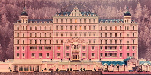
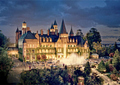
Figure 2. The father's red car in The Darjeeling Limited. This reversion back to childlike dependency is common in the themes of Anderson's work. Critics fault him for neglecting character development in light of fantastical set design, though his characters offer viewers a sense of restraint juxtaposed with their lavish settings. Monsieur Gustave (Ralph Fiennes) in The Grand Budapest Hotel (2014) is a character of refi ned elegance, running the nicest hotel in the fi ctional republic of Zubrowka (refer to Figure 3). Though, his fi lms do tend to center on childhood, both "literal and prolonged" (Orgeron, 2007, p.42) and the need to create communities in the face of familial abandonment. It is worldly communities, i.e. Jamaica and Africa, in which Margo Tenenbaum and her mother separately go searching for themselves after they separated from the family. Monsieur Gustave, a man who trained for years without a family to become the concierge of the hotel, fi nds solace in Zero Moustafa, the immigrant lobby boy also without a family who later becomes his most trusted friend.
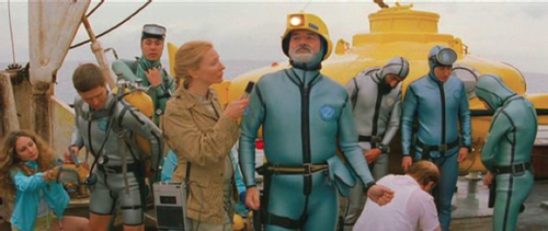
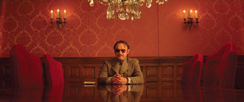
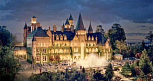
Figure 3. Image of the Grand Budapest Hotel Anderson constantly positions himself around the concept of youth. In The Grand Budapest Hotel, M. Gustave sleeps with older women as a boyish conquest for wealth. Moonrise Kingdom is a fi lm that centers on the concept of lost youth and the rediscovery of it in young love. The "moonrise kingdom" is the refuge for which Sam and Suzy, both adolescents, are looking. Yellow is often a color of optimism in the fi lms of Anderson, which is apparent in the uniforms of the scouts in this fi lm. Yellow is also symbolized in many of his fi lms as a color of peace. For example, the sky in The Fantastic Mr. Fox is yellow when the foxes are happiest. The submarine of Steve Zissou is yellow, one of the only things that brings him happiness until he fi nds the yellow sea creature he had been searching (refer to Figure 4).
Figure 4. Steve Zissou with his fi lm crew. Color can establish a mood that is in keeping with the action or environment a director wishes to portray on the screen. It brings about this fairy tale-like existence in Anderson's fi lms because his levity often times contrasts grim situations. The hospital room is bright and bustling with family members after Richie Tenenbaum tries to commit suicide. Here Anderson plays with the stress that society places on menial factors–in darkness he presents us with light as a sort of childish optimism. In The Darjeeling Limited when the young Indian boy dies, his funeral rites are set against glimmering golden light, stark white vestments and a vibrant town in the background. Socially, the three white protagonists stick out as irreverent Americans. Often times he uses whiteness as a framework for social stability (Dean-Ruzicka, 2012, p. 26). We also see this in the familial structure of the Tenenbaum family. Anderson uses deep, rich colors to highlight the color of the characters' white skin, as we see in the scene with Royal at the dinner table. "As in The Royal Tenenbaums, colors in the fi lm serve to highlight and reinforce the whiteness of the main character" (Dean-Ruzicka, 2012, p. 36). For non-white characters, Anderson tends to use neutrals to accentuate their skin. Likewise, characters of color often portray second-class citizens of society. Kumar Pallana, a reoccurring actor in Anderson fi lms, typically portrays an elderly ethnic man who does not seem to comprehend everything going on. He acts often as a foil for the disillusioned older white gentlemen in his fi lms. This is one such case in The Royal Tenenbaums, as Pallana's character, Pagoda, provides a sense of stability and unwavering gumption for the isolated Royal (see Figure 5).
Figure 5. Royal Tenenbaum positioned alone at the dinner table. V. ConclusionIn this post-modern era of cinema, its societal functions and stressors are heavily scrutinized. Anderson offers unto viewers a "childlike absorption in the all-too-adult bittersweetness of the world" (Austerlitz, 2010, p. 382), neglecting reality and projecting fantasy. This notion directly correlates to the reasons why his darker screenplays are treated with brilliant color palettes and humoristic undertones. These colors are intentional and represent facets of society, such as patria potestas (power of the father), but also signify a boyish reverence for the unstoppable imagination of youth. The color he uses brings about a feeling of irony and optimism.
Figure 6. Color palette used in The Darjeeling Limited. It is said that Anderson tends to draw upon inspiration from his favorite artists–J.D. Salinger, Truman Capote, and Orson Welles–and incorporate facets of their work into his. Welles' The Magnificent Ambersons was adapted to be The Royal Tenenbaums, though the outcome of his work is positive in nature unlike that of his counterparts (Mayshark, 2007, p. 128). Anderson reverts back to a state of childlike optimism in his fi lms, crafting these ultra realities that suit the needs of his characters and the outcome he would like to have seen as a child from his favorite works. The use of color in his set design and his costuming is masterfully engineered to engrain itself into the minds of an audience and establish a certain mood for a fi lm. His characters are social indicators, often times of a broken family that sews itself back up. Anderson's auteur style hinges on his experiences as a child. Without disappointment in his own adolescence, he would have never been able to craft these extravagant stories. That is what his films are, in fact. Rushmore is presented as a play in five acts. The Royal Tenenbaums is a book narrated by Alec Baldwin – as scenes change, the proverbial pages flip. The Life Aquatic with Steve Zissou is a present-day self-reflection of his fi lmmaking and the chaos it brings (Austerlitz, 2010, p. 382). The Grand Budapest Hotel is presented as a fable. In an interview, Anderson speaks to the quirkiness of his characters: "I find certain kinds of behavior entertaining, I like the idea of people taking their extreme feelings and acting out on them. So I don't know if I'd really make that much of a distinction between which one's an adult and which one's a child, and what does it mean for this person to do this, this person to do that. I guess I just go on a case-by-case basis." (Seitz, 2013, p. 296) In contemporary fi lmmaking, it is not uncommon to push limits in order to exact a desired psychological response. Filmmakers such as Abdellatif Kechiche (Blue is the Warmest Color) and Darren Aronofsky (Requiem for a Dream) are widely known for their unmistakable styles, but what sets Anderson apart is his ability to treat pertinent topics with levity and brilliant set design, exacting a style unmistakably "Andersonian" (see Figure 6). AcknowledgmentsThis author is thankful to Don Grady, associate dean in the School of Communications at Elon University, for his supervision and advice, without which the article could not be published. The author also appreciates numerous reviewers who have helped revise this article. AuthorA. Vaughn Vreeland, Media Arts and Entertainment and French, Elon University ReferencesAusterlitz, S. (2012). Another fi ne mess: A history of American fi lm comedy. Chicago, IL: Chicago Review Press. Block, B. (2008). The visual story: Creating the visual structure of fi lm, TV and digital media. New York, NY: Focal Press. Dean-Ruzicka, R. (2012). Themes of privilege and whiteness in the fi lms of Wes Anderson. Quarterly Review of Film and Cinema, 30(1), 25-40. Gegenfurtner, K., & Sharpe, L. (2000). Color vision: From genes to perception. Cambridge: Cambridge University Press. Grobar, M. (2015). "Minding the details." Deadline Online. Deadline.com. Web. Hubris-Cherrier, M. (2012). Voice and vision: A creative approach to narrative fi lm and DV production (6th ed.). Boston, MA: Focal Press. Mayshark, J. F. (2007). Post-pop cinema: The search for meaning in new American Film. Westport, CT: Praeger. Orgeron, D. (2007). La Camera-Crayola: Authorship comes of age in the cinema of Wes Anderson. Cinema Journal, 46(2), 40-65. Pölönen, M., Salmimaa, M., Aaltonen, V., Häkkinen, J., & Takatalo, J. (2009). Subjective measures of presence and discomfort in viewers of color-separation-based stereoscopic cinema. Journal of the Society for Information Display, 17: 459–466. Prince, S. (2012). Digital visual effects in cinema: The seduction of reality. New Brunswick, NJ: Rutgers University Press. Robinson, S. (Writer and director). (2011). Do you see what I see? The science of color perception. BBC Worldwide. (Available from Films Media Group, New York, N.Y.) Seitz, M. (2013). The Wes Anderson collection. New York, NY: Abrams. Yumibe, J. (2012). Moving color. New Brunswick, NJ: Rutgers University Press. Zettl, H. (2011). The extended first field: color. In sight, sound, motion; applied media aesthetics (6th ed.). Belmont, CA: Wadsworth. This article was published in Elon Journal of Undergraduate Research in Communications A publication of Elon University 
From the Inquiries Journal Blog   Related ReadingJournalQuest is a free program to help academic student publications increase online readership and distribution. If you are interested in enrolling a journal at your school, please visit the JournalQuest website. Monthly Newsletter SignupThe newsletter highlights recent selections from the journal and useful tips from our blog. Suggested Reading from Inquiries Journal
Inquiries Journal provides undergraduate and graduate students around the world a platform for the wide dissemination of academic work over a range of core disciplines. Representing the work of students from hundreds of institutions around the globe, Inquiries Journal's large database of academic articles is completely free. Learn more | Blog | Submit Follow IJ
Latest in Film & Media |